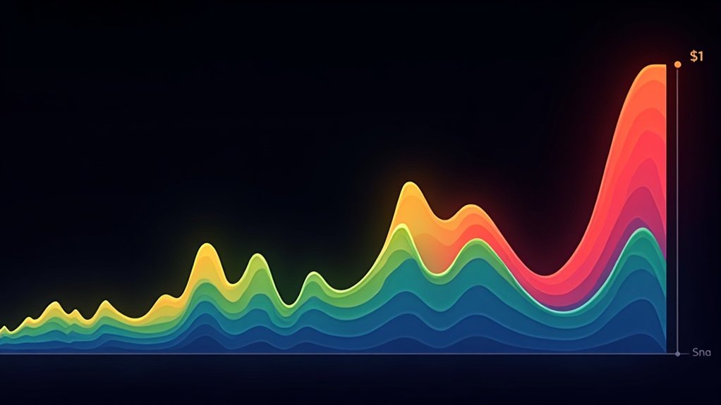

The Bitcoin Rainbow Chart isn’t magic—just a handy visual tool that plots Bitcoin’s price on logarithmic bands of color. Blue zones? Potentially undervalued. Red? Possibly bubble territory. Yellow means business as usual. Developed in 2014, it helps investors cut through market noise and emotional decision-making by showing historical price contexts. Not a crystal ball for future prices, just a reality check for where things stand. The rainbow’s true power lies in its simplicity.
Simplicity can be revolutionary in the chaotic world of cryptocurrency. The Bitcoin Rainbow Chart embodies this principle, offering investors a straightforward visual tool to navigate Bitcoin’s notorious price volatility. At its core, this chart plots Bitcoin’s price on a logarithmic scale, overlaying it with colorful bands that represent different valuation levels. Not rocket science. Just a practical way to visualize whether Bitcoin might be cheap, fairly priced, or expensive based on historical patterns.
The chart typically features seven to nine color bands, ranging from blue (lowest valuation) to dark red (highest valuation). Each color tells a story. Dark blue screams “Fire Sale” – Bitcoin might be seriously undervalued. Green suggests it’s a decent time to buy. Yellow indicates fair value territory. Orange warns caution. Red? That’s bubble territory, folks. These aren’t random colors either. They’re derived from logarithmic regression analysis of years of Bitcoin price data. With 95% supply mined already in circulation, these price patterns become increasingly relevant for investors tracking market dynamics.
The rainbow isn’t just for show – it’s Bitcoin’s story told through colors derived from years of mathematical pattern analysis.
Market sentiment shifts wildly in crypto. One day everyone’s a genius, the next they’re licking their wounds. The Rainbow Chart helps cut through the noise. When Bitcoin’s price falls into the blue zones, long-term investors (the “HODLers”) often see buying opportunities. When it creeps into the red, it might be time to think about taking some profits. Yellow? Business as usual. This visual tool was originally developed in 2014 by a Reddit user named isthishappening who sought to make Bitcoin’s market cycles more accessible.
Don’t mistake this for a crystal ball, though. It’s a context tool, not a fortune teller. The chart simply shows where Bitcoin stands relative to its own historical cycles. Nothing more, nothing less.
Investors use this tool differently. Some swear by it for timing market entries and exits. Others combine it with additional indicators for a more thorough view. It’s particularly handy for those looking to ride Bitcoin’s full market cycles rather than day trade the chaos. The Rainbow Chart won’t make you rich overnight. But in a market driven by fear and greed, a splash of color might just help keep your emotions in check. The chart also accounts for Bitcoin Halving events that occur approximately every four years and typically influence price movements.
Frequently Asked Questions
Who Created the Original Bitcoin Rainbow Chart?
The original Bitcoin Rainbow Chart was created by Reddit user “azop” in 2014.
Born during the Mt. Gox crisis and subsequent bear market, it started as a humorous meme.
Nothing fancy—just colored bands on a logarithmic scale.
No curved regression lines yet. Just straight rainbow colors showing buy, average, and sell zones.
Azop posted it on the r/Bitcoin subreddit, hoping to boost community morale during tough market conditions.
Pretty clever, actually.
How Accurate Has the Rainbow Chart Been Historically?
The Rainbow Chart has been surprisingly accurate for a simple log regression model. Great at spotting extremes—buying in blue zones, selling in red.
But it’s not perfect. The original version completely broke during the 2022 bear market when prices crashed below its lowest band. Had to be recalibrated.
It captures Bitcoin’s overall trajectory well but misses black swan events, regulatory shocks, and unprecedented market conditions.
Decent guide, terrible crystal ball.
Can the Rainbow Chart Predict Short-Term Bitcoin Price Movements?
The Rainbow Chart sucks at short-term predictions. Plain and simple.
It’s built for long-term valuation, not day-to-day price moves. Bitcoin’s short-term swings are driven by news, liquidity, and trader psychology—stuff the chart doesn’t factor in.
Serious traders don’t rely on rainbow colors for timing next week’s trades. They combine it with technical indicators like RSI and moving averages.
Think of it as the backdrop, not the crystal ball.
Does the Rainbow Chart Work for Cryptocurrencies Other Than Bitcoin?
No, the Bitcoin Rainbow Chart doesn’t work well for other cryptocurrencies.
It’s specifically calibrated to Bitcoin’s unique price history and logarithmic growth patterns.
Altcoins have different volatility profiles, shorter price cycles, and less historical data to work with.
Some traders have attempted to create similar charts for other cryptos, but these lack widespread validation.
Each cryptocurrency has its own market dynamics, adoption curves, and fundamental drivers.
One size definitely doesn’t fit all in crypto analysis.
How Often Is the Bitcoin Rainbow Chart Updated?
The Bitcoin Rainbow Chart updates automatically in real-time as Bitcoin’s price changes. No waiting around.
Most versions refresh continuously to keep investors informed amid Bitcoin’s notorious volatility. Some professional versions, like Bitbo Charts’ original, update hourly.
The technical side? Automated scripts pull live price data from exchanges through APIs. Developers occasionally release upgraded versions with tweaked algorithms – like the V2 in 2022 that modified bands to reflect Bitcoin’s evolving market behavior.
Pretty slick system, actually.